Table of Contents
Drug rehab website navigation is the design of website menus, links, search, buttons, and page paths so visitors can find the right information quickly, clearly, and without confusion.
On an addiction treatment facility website, it helps people locate treatment options, admissions steps, insurance or payment details, privacy information, locations, and contact options during a stressful decision.
Strong navigation uses plain labels, simple menus, mobile-friendly layouts, visible calls to action, working links, fast pages, and clear internal pathways.
It improves trust, accessibility, user satisfaction, engagement, and SEO by helping both visitors and search engines understand where important content is located.
Key Takeaways
- Navigation acts as a trust signal: clear, empathetic, and action-oriented menu labels directly enhance credibility and conversion, especially under emotional stress.
- Cognitive load spikes where navigation lacks clarity; structured, supportive menus and minimal link overload preserve decision momentum and reduce abandonment.
- Mobile-first, accessible navigation (e.g., sticky calls-to-action, collapsed content) meets the urgent timing and emotional state of users seeking rehab help.
- Continuous improvement – via behavioral analytics, admissions staff insights, and scenario-driven audits – uncovers hidden friction and sustains trust on high-stakes rehab websites.
Every decision about navigation structure has an outsize effect on whether visitors find the help they urgently seek.
Yet, many rehab websites rely on generic menus, overlooking how deeply these choices influence trust and conversion.
Most leaders assume well-written content is enough – but the real business driver is how navigation answers stress-driven questions in the moment.

Why Navigation Choices Directly Impact Outcomes on Drug Rehab Websites
Navigation choices shape more than user flow – they signal credibility at the very moment a visitor weighs seeking help.
People searching for addiction treatment want clarity in seconds.
Yet, menus that feel copied from template sites or that add extra clicks introduce friction, turning curiosity or desperation into skepticism.
Time after time, treatment centers invest in raising awareness, only to lose high-intent users to silent confusion in their navigation.
Navigation as a Trust and Conversion Signal in Addiction Treatment
The common assumption: if information is available, trust will follow.
But in reality, stressed visitors perform rapid trust checks based on how readily they can reach decision-makers or detailed program answers – navigation is the first real proof of reliability.
Well-placed, descriptive links to admissions and programs double as trust signals and subtle calls to action.
A single menu misstep – like hiding the “Start Recovery” button or burying direct contact – dampens both confidence and conversion.
Language and structure matter.
A navigation bar that begins with action-oriented paths can shift a visitor’s mindset from reluctant research to purposeful engagement.
In addiction treatment, trust is not simply earned with content but is repeatedly affirmed – moment by moment – as navigation removes obstacles or inserts new ones.
The greatest business threat isn’t missed phone calls but invisible abandonment when a user pauses and exits for a competitor offering a simpler path.
These incremental leaks represent both lost trust and direct revenue – a silent drain especially potent where choices are urgent and high-stakes.
Understanding Stress-Driven Decision Patterns in Web Navigation
Most website navigation is built for casual, low-pressure exploration.
However, this approach fails visitors wrestling with addiction decisions or supporting a loved one.
These users arrive in a state of anxiety, urgency, and sometimes panic – often via mobile devices – seeking the shortest and most obvious path.
Traditional structures that ask them to traverse long, multi-layered menus amplify doubt and delay action.
Picture a traditional navigation menu as a detailed store directory – excellent for window shoppers.
But when real stakes and urgency are present, every extra menu or ambiguous term becomes a barrier, not a guide.
In this category, clarity, reassurance, and speed are indispensable; a delayed path to programs or live support doesn’t just inconvenience the user, it actively pushes them elsewhere or into uncertainty.
Business risk emerges when navigation treats urgent, stressed visitors the same as relaxed ones.
Addiction treatment websites cannot afford to overlook that difference – each unnecessary menu step adds friction and undercuts the chance to earn trust or an inquiry.
Quick-access pathways to programs, admissions, or live support don’t just reduce frustration; they actively convert stress into action.
Therefore, smart navigation isn’t cosmetic – it’s a direct lever for converting emotional urgency into meaningful contact and trust.
In rehab, it’s seldom the design awards that win; it’s the practical clarity that delivers results.
Which leads to a sharper question: how do you craft navigation that reduces hesitation for individuals in crisis, while maintaining the integrity and credibility your facility promises?

Consider how a well-structured navigation can lead to profound user satisfaction and engagement on your rehab center’s website.
Core Principles for Building Emotionally Accessible Rehab Site Navigation
The foundation of drug rehab website navigation lies in its power to move visitors from overwhelm to a place of clarity and possible action.
But what may seem logical to web teams often leaves families and individuals under pressure confused or lost.
Many assume usability means clinical efficiency – yet, for this audience, emotional accessibility trumps generic convenience.
Plain Language and Compassionate Menu Labeling
Standard menus too often hide treatment paths behind medical jargon or internal branding.
But visitors in distress don’t decode abstract or overly formal language – they disconnect from it.
The prevailing belief is that authoritative, technical descriptors provide comfort, when in truth, plain and warm wording is what guides people toward help.
Change “Admissions Information” to “How to Get Started”, or recast “Programs & Modalities” as “Treatment Options”.
Draw from the words actual callers use in their first few moments of conversation – not from inside terminology.
If a menu label gives you pause or feels chilly rather than calming, it’s contributing to cognitive overload, not reducing it.
Try reading your main navigation aloud to someone feeling anxious or overwhelmed.
Does any phrase sound abrupt, cold, or at odds with reassurance?
Each confusing moment builds hidden friction, directly eroding trust and increasing dropout risk.
Sample Compassionate Menu Labels (Quick Reference Table):
| Current Menu Label | Recommended Compassionate Menu Label |
| Admissions Information | How to Get Started |
| Programs & Modalities | Treatment Options |
| Insurance Verification | Check My Insurance |
| About Us | Who We Are |
| Contact | Speak to Our Team |
| FAQs | Answers for Families & Individuals |
Use these sample labels as a model for user-friendly navigation that addresses low-comprehension or high-stress states.
Audience-Based Pathways: Individual, Family, and Professional Navigation Options
Audience-Based Navigation Options
| User Type | Sample Menu Path | Destination/CTA Example |
| Individual | For Myself | Personalized Assessment, Verify Privacy |
| Family | For a Loved One | Family Support Resources, Start Now |
| Professional | For Professionals | Referral Guide, Insurance Verification |
Flat navigation ignores the most important visitor differences.
An individual seeking help needs a different discovery process – and emotional context – than a parent, or than a clinician looking for referral routes.
But most rehab websites blend these journeys into a single, generic structure, forcing visitors to hunt for relevance.
Create clear menu starting points: “For Myself”, “For a Loved One”, and “For Professionals”.
Each becomes a dedicated avenue to information, resources, and next steps that fit the user’s specific mindset and needs.
For instance, someone worried about privacy may need quick, discreet answers, while families want visible support resources from the start.
When users instantly see a path that recognizes their situation, resistance drops.
Conversion starts before any content is read – when visitors notice you “see them” via navigation alone.
Have you made it intuitive for each audience type to find their next step within seconds?
Audience-Based Navigation Options (Example Matrix):
| User Type | Sample Menu Path | Destination / CTA Example |
| Individual | For Myself | Personalized Assessment, Verify Privacy |
| Family | For a Loved One | Family Support Resources, Start Now |
| Professional | For Professionals | Referral Guide, Insurance Verification |
Integrate clear navigation for families and individuals as explicit internal links or top-level menu items to improve treatment program accessibility and user-friendly navigation for every visitor segment.
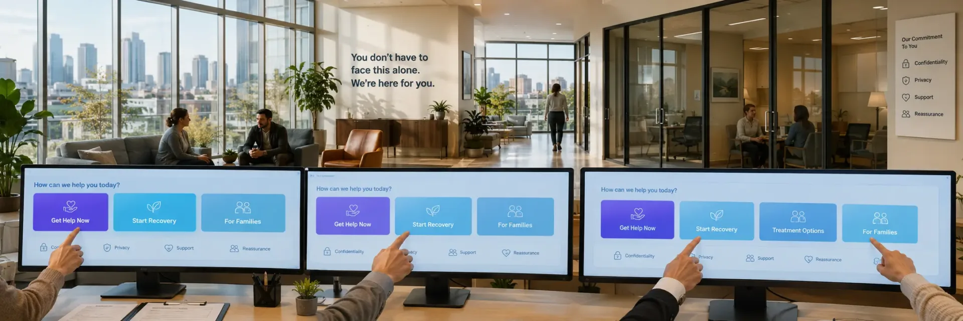
Prominent Quick-Access Options: ‘Get Help Now’ and Crisis CTAs
Visitors in urgent need do not browse; they scan for lifelines.
Yet, many rehab sites tuck “Get Help Now” or crisis contacts out of immediate view, inadvertently raising the barrier to outreach.
The practical and reputational costs of this can be steep.
Provide a clearly visible, always-accessible “Get Help Now” call to action – whether as a sticky bar, floating icon, or standout button.
For those dealing with acute stress, these features aren’t bells and whistles; they’re critical tools that drive action when seconds matter.
A good litmus test: from any landing page, can a visitor connect with a real person (via call, chat, or form) in a single, unmistakable click?
If the answer is no, then the navigation may be prioritizing backend operations over the emotional urgency of your audience.
Quick-Access Pathways and CTAs (Sidebar Example):
- Get Help Now (one-click call/chat)
- Start Recovery Today
- Verify Insurance Coverage
- Speak to Admissions (direct link for rehab admissions navigation)
- 24/7 Emergency Contact (navigation for urgent visitors)
*Promote these user-friendly navigation links using distinct color or sticky placement to ensure visibility for all user segments, including families and individuals.*
Emotionally accessible navigation builds safety and trust before a word of content is even read.
Getting these core principles right sets the stage for structuring pathways that meet every visitor’s unique circumstances and sense of urgency.

Optimize your navigation to ensure that it is.
Structuring Navigation for Decision Momentum: From First Click to Contact
Effective drug rehab website navigation isn’t just about showing users where to go – it’s about sustaining their intent from arrival to contact.
But most sites confuse clarity for momentum, leaving users circling in indecision instead of moving forward.
The real opportunity lies in structuring every menu and marker to shorten the distance between overwhelm and a confident click to connect.
Scalable Menu Structures and Logical Content Grouping
A well-designed menu drives more than convenience – it directs visitors through emotional and informational turning points.
But while many drug rehab sites copy generic layouts, bloated with dropdowns, this approach doesn’t scale as content grows or user needs shift under real-world pressures.
More options feel like thorough service, but decision science tells us that each extra choice slows momentum.
High-performing sites group links by distinct user intentions – such as “Types of Treatment”, “Admissions Process”, or “Immediate Help” – so visitors instantly spot what matters.
This means even a growing site stays usable, especially for mobile users, since clear groupings cut through clutter and keep critical actions easy to find.
Consider this: just as clear hospital signage guides families under stress, navigation structure should anticipate urgent needs and emotional states.
Conversion grows not from endless options, but from anticipating when a browsing visitor is ready to move decisively toward admissions.
Fail to design for this shift, and site expansion will scatter user attention, undermining both trust and business growth.
Menus focused on user progression scale smoothly as new treatments or programs are added, preventing fragmentation and protecting the user’s sense of control.
If structure is dictated by internal silos, the pathway to action becomes increasingly difficult to follow.
Integrating Breadcrumbs and Decision-State Location Cues
A visitor’s journey is rarely linear: switching from “Inpatient Programs” to “FAQ”, then abruptly needing “Verify Insurance”.
Here, breadcrumbs and well-placed location cues are not technical extras but essential orientation tools, crucial at points of high anxiety.
So why are these elements missing from most rehab sites?
Often, they’re dismissed as minor features, but in reality, they’re lifelines – reminding users exactly where they are and how to recover from a misstep.
For families or individuals under stress, a lapse in location clarity can quickly translate to a lost opportunity for contact.
Persistent headers, progress indicators, or sticky contact buttons give reassurance at each step and are especially valuable on mobile devices, where distractions and disorientation spike.
The practical business outcome: users who remain oriented stay engaged and are far likelier to reach out for help, not just consume information.
Breadcrumbs also serve another purpose: bridging research with immediate action.
Where competitors overlook this, smart navigation reduces friction at transition moments, visible in analytics as decreased backtracking and higher engagement at decision points.
Technical Integrity: Speed, Security, and Reliability as Navigation Foundations
Every second a site hesitates or fails, trust erodes – especially in sensitive environments like addiction recovery.
Yet, many rehab teams treat technical upkeep as an afterthought rather than a navigation issue, creating silent risks both to credibility and conversions.
A slow-loading menu, a single broken link, or a security warning can make users question care standards before they ever contact admissions.
On a drug rehab site, these technical gaps don’t just stop visits – they undermine the perception of reliability and compassion, raising business risks no SEO tweak can repair.
Commitment to technical health – auditing links, securing forms, and designing for all screen sizes – forms the silent foundation beneath every interaction.
This enables visitors to move smoothly from question to contact, strengthening trust at each step and preserving the site’s authority where it matters most.
Strong technical integrity and reliability are also central to SEO for rehab sites, as search engines prioritize secure, fast-loading, and mobile-responsive navigation structures in this competitive industry.
Remember: navigation is where infrastructure and empathy meet.
Speed, uptime, and clear organization all shape the visitor’s sense of safety – the core prerequisite for taking that crucial step toward help.
Next: even with structural clarity and resilience, mobile visitors in crisis bring new challenges – how will your site’s navigation deliver urgency without confusion?

Take the next step in navigation design to ensure that every user’s visit is effective and reassuring.
Mobile-First Navigation: No-Frustration Design for Any Device
Mobile users searching for treatment rarely have time or peace of mind to spare – they make decisions in brief, tense bursts.
But most rehab websites still treat mobile navigation as a re-sized version of their desktop site.
Yet, the gap is real: true mobile-first design eliminates hidden obstacles at precisely the moment users need clear, instant pathways.
Just ten seconds fumbling for an admissions button can be the difference between reaching out or giving up.
Still, it’s common to find buried menus, tiny tap zones, or dead ends that quietly kill momentum.
What truly derails action isn’t a lack of care or intent, but the invisible drag of usability pain points that appear only under pressure.
Every interaction on mobile must feel deliberate and frictionless.
If a parent or individual can’t understand the next step at a glance, conviction erodes and effort drops.
Many sessions end – not from unwillingness – but from one too many roadblocks on a crowded screen.
Therefore, what’s at stake is more than conversion metrics; it’s whether help feels accessible or just out of reach.
Navigation must empower swift, stress-free decisions for those with little time, or suffering decision fatigue mid-search.
Yet, most best-practice guides offer only generic mobile responsiveness, missing the urgency rehab audiences face.
Teams may not notice the subtle friction while in desktop mode, but rushed visitors do the second they get stalled in a parking lot, outside work, or supporting someone in crisis.
So which specific mobile features actually keep decision energy high when urgency peaks?
Mobile Navigation Patterns that Maximize Access Under Stress
Effective mobile navigation for rehab sites isn’t simply slimming down menus – it’s building a triage system for fast action.
These three patterns consistently clear the way for urgent users:
First, swipeable menus (like the hamburger icon with direct-to-admissions or instant-help shortcuts) declutter the view but keep critical actions just a swipe away.
Instead of scrolling or pausing to read, people in distress home in on clear, immediate choices.
Second, sticky call and chat buttons anchored at the bottom of the screen make connecting a one-tap move.
Nobody under stress should hunt through footers – persistent help buttons in thumb range ensure that action is never more than a moment away.
Dimensions must be generous, balancing ease with precision so no opportunity slips through a missed touch.
Third, collapsible FAQs and contact options tamp down cognitive overload while leaving solutions just one touch away.
The benefit: urgent answers stay visible, not hidden in a maze of new pages.
Which questions are most likely outside regular hours or during quick breaks?
That’s where removing extra taps matters most.
Commercially, every second lost to confusion costs trust and momentum.
The wrong menu, tiny icons, or missing shortcuts turn motivated audiences into silent drop-offs.
Don’t think of mobile navigation as just a map – see it as a series of unmistakable signposts at every stressful junction.
If your site still feels optimized for the desktop at the expense of clarity on the go, small frustrations will compound at the moments visitors are least able to persist.
Mobile Navigation Patterns for Rehab Site Usability
- Swipeable menus with direct shortcuts to admissions or instant help reduce clutter and keep critical actions accessible.
- Sticky call and chat buttons anchored at the bottom of the screen enable one-tap contact for urgent users.
- Collapsible FAQs and contact options reduce cognitive overload while keeping urgent answers easily reachable.
Incorporate these mobile-responsive navigation patterns for optimal drug rehab site usability.
The real test of mobile navigation is what happens when someone arrives carrying stress, urgency, and barely a minute to spare.
Next: which signals ensure anxious visitors feel safe taking action – and how do subtle missteps make hesitation visible before a word is spoken?

Embark on this journey to provide an unmatched online experience for those in need of guidance.
Continuous Navigation Improvement: Translating Real User Feedback into Action
Navigation on drug rehab websites is often treated as a box to check at launch.
Yet actual user needs and behaviors shift quickly, especially in moments of urgency.
The prevailing assumption that navigation can be solved once leads sites to miss the most revealing (and costly) signals for ongoing improvement.
Behavioral Analytics: Tracking High-Intent Navigation Failures
It’s tempting to believe that menu usage data means all visitors find what they want.
However, analytics often mask the story of visitors with urgent intent who wander, hesitate, or exit without help.
The real opportunity lies in examining what happens between initial click and lost conversion – where CTAs go unnoticed and session paths zigzag between main pages and secondary content.
Notice reversals in page flow: a visitor jumps from homepage to treatment details, hovers on admissions, then pulls back to FAQs or About.
That’s not idle browsing – that’s friction.
When exit rates spike directly after engagement with core navigation, not after reading lower-level content, it’s a warning.
Business impact is direct: each missed click or bounce isn’t just a lost visit, but a potential admission left unresolved.
Burying high-intent signals within aggregate user data dilutes their meaning.
Effective drug rehab site teams segment behavior for those closest to a decision, identifying navigation pain points that matter most.
This is where targeted changes make the difference between increased admissions and ongoing leakage.
Tracking high-intent user journeys is essential for ongoing improvements to drug rehab site usability, ensuring treatment program accessibility and reinforcing quick-access pathways.
Admissions Staff as Navigation Signal Collectors
Analytics reveal where users struggle, but rarely why.
Admissions and phone staff, in direct contact with visitors, capture live friction as it happens – “Where’s the insurance page?”, “Do you accept my policy?”, “How can I start detox tonight?” These moments expose confidence gaps that numbers alone cannot explain.
The false belief: digital audits suffice for QA.
In practice, a week of voice-of-caller logs can uncover frequent navigation breakdowns analytics overlook.
Admissions staff report the same navigation confusions repeatedly – issues no click-path data surfaces.
When this feedback goes unshared, teams chase surface-level metrics while real conversion losses mount overnight.
The risk is not just missed optimization, but compounding trust gaps that turn urgency into inaction.
Connecting admissions feedback to web teams is not an afterthought; it is foundational to sustaining trust and maximizing call volume.
Systematic logging and review mean pain points become action items – not recurring blindspots.
Checklists and Playbooks: Post-Launch Audit for Rehab Navigation
Go-live is not the end of navigation quality.
Drug rehab sites operate under shifting regulatory, insurance, and competitive demands.
Without a routine checklist and playbook, navigation quickly grows out of sync with what decision-makers and families urgently seek.
A strong post-launch playbook covers several bases: mapping and reviewing top entry and exit points by device, collaborating with admissions to chase down frequent confusions, tracking time-to-key-action for those who show intent, and vetting navigation paths in both calm and crisis scenarios.
Quarterly stakeholder reviews, matching real user questions with observed browsing patterns, convert maintenance into a growth driver.
Each cycle strengthens site trust and reduces loss at the margin.
Most providers lack any formal structure for these reviews; they rely on outdated assumptions and miss subtle shifts in user needs.
Executives who bake these playbooks into site governance see navigation and conversion as living targets rather than fixed achievements.
Navigation must become a living system – merging behavioral analytics, direct feedback from admissions, and structured self-audits.
But with these controls comes a new challenge: tying every future improvement directly to trust-building and admissions gains, driving greater value than a generic usability update ever could.

Transform your site today to create a more engaging and seamless user experience.
Scenario-Based Navigation Audits: Decision Signals for Executives
Drug rehab websites often appear user-friendly on the surface.
However, stress-tested scenarios reveal navigation failures that quietly erode trust when it matters most.
Many executives believe internal reviews are enough, yet critical breakdowns only surface under real visitor pressure.
Identifying Risk Patterns: What Common Navigation Flaws Signal an Urgent Redesign
Navigation risks rarely look like glaring, system-breaking errors.
Instead, they appear as subtle but damaging leaks: ambiguous menu labels, half-buried admissions links, dead-ends in program information, and unresponsive elements on mobile.
These flaws typically evade team walkthroughs but are exposed when modeled through high-stress user journeys.
The biggest navigation risks include: menus that overwhelm or mislead urgent visitors, CTAs that are too faint to drive action, and legacy tech issues that quietly block mobile access at critical junctures.
Such failures don’t attract complaints but result in a higher incidence of session drop-offs, missed calls, and no contact – especially when mapped in scenario-based audits simulating intense, real-user conditions.
Crucially, silence isn’t safety.
The belief that “no news means good navigation” leads to missed trust signals at the exact moment urgency spikes.
Audit uncover where next steps hide under extra layers or crucial details drop below the fold, resulting in lost contacts and stalling decision momentum.
If a desperate family member can’t reach admissions with two clicks, the site has already lost more than traffic – it’s lost opportunity and trust.
Where does internal review diverge from real-world urgency?
When navigation friction remains invisible in routine testing but is lethal in crisis mode.
Decision-Ready Opportunities: Lessons for Navigation That Supports Action and Trust
Insights from scenario-based audits don’t just spotlight what’s broken – they reveal navigation moves that build urgency and help trust grow.
The strongest levers often mask themselves beneath routine language and assumed user journeys.
For instance, shifting from generic labels (“Programs”) to outcome-driven cues (“Start Treatment Today”) unlocks more immediate action.
Making navigation mobile-first – persistent admissions buttons, direct family access, frictionless live chat – proves empathy and removes doubt, especially for time-sensitive visitors.
A simple pattern: every unnecessary navigation layer in stressed scenarios increases the risk of losing both trust and inquiry.
Consider navigation as clear emergency hospital signage – no ambiguity, only paths that inspire action when every second matters.
When visitors can’t instantly spot their next step or feel reassured about privacy and trust, the penalty is immediate: fewer inquiries, damaged reputation, missed mission.
What’s the real lever?
Executives who advance from static reviews to scenario-based audits unlock navigation improvements that boost trust, split ambiguity, and accelerate conversion.
Trust badges, clear privacy cues, and decisive admissions flows protect business outcomes not just for families in crisis, but for every visitor.
The best navigation for urgent audiences always elevates the experience for all users, never the reverse.
Therefore, making scenario-driven audits routine transforms weak warning signs into reliable, actionable signals.
Executives who adopt this lens keep their rehab website navigation agile and decision-ready – ensuring every improvement matches how real users choose help.

Executive Navigation Optimization Checklist: A Decision-Maker’s Fast Path to Stronger Results
Executive Navigation Optimization Checklist
- Ensure every core menu item maps to user needs rather than internal divisions.
- Enable urgent users to reach key actions in two clicks from anywhere on the site.
- Keep mobile navigation links visible and easy to tap, avoiding buried menus.
- Place trust signals one click away from all primary navigation routes.
- Provide clear, relevant next steps for families and individuals to avoid confusion.
- Highlight urgent help options visually to stand out from informational links.
- Use simple, jargon-free navigation labels understandable at first glance.
Most drug rehab web projects fixate on visual flair or ranking boosts.
But a modern homepage is wasted if users can’t see their next step at a glance.
The bigger challenge: trust and conversion growth depend on a handful of overlooked navigation details that rarely reach the executive’s desk.
Many still believe navigation is about menus or how many pages appear upfront.
Yet user-friendly navigation is built on clear decision routes – guiding real people, often under time or emotional strain, straight to action with no detours.
Silence from users is no assurance; hidden friction slowly weakens conversions and trust.
Generic redesigns and routine UX efforts miss what matters without an executive checklist built on behavioral reality.
Use the following decision criteria to expose invisible roadblocks and focus on fixes that move both users and the business forward.
- Does every core menu item map to what users actually need to decide – not internal divisions? Menu labels written for teams confuse; those framed in users’ terms create clarity. Check if your main pathways reflect questions like “Treatment Options” or “Admissions Process” instead of internal department language.
- Can a user in urgent need reach key actions – contact, FAQs, or live help – in two clicks from anywhere? Visitors in distress won’t tolerate detours. Test for the shortest path: is any critical next step free of friction or distractions?
- Does your mobile navigation keep action-driving links visible and easy to tap – never buried in menus? The right mobile menu turns urgency into opportunity, while confusing ones cause drop-offs from high-intent users. Review mobile layouts for instantly present admissions or contact links.
- Are trust signals – like accreditations, ratings, or clinician profiles – one click away from every primary navigation route? Doubt holds visitors back unless proof appears quickly. Walk through main journeys: is trust visible before users think to search for it?
- Can both families and individuals see clear, relevant next steps, avoiding confusion over who each route serves? One-size menus misfire for the multiple audiences of a rehab website. Assess if all links and CTAs spell out which audience each path is for, minimizing hesitation.
- Do urgent help options – admissions, rapid contact – stand out visually from informational links? Calls-to-action should never get lost among resources or secondary pages. Does your most important button or menu item stand apart by color, placement, or text clarity?
- Is every navigation label simple, direct, and free from internal shorthand or jargon? Let an outside tester read your menu: are options instantly clear, or do they cause a pause? If understanding falters, refinement is overdue.
- Is the admissions process immediately visible, low-risk, and simple to start from the main navigation? Hidden admissions links erode urgency and lower conversions. Check analytics for drop-offs after a navigation click – these signal hidden friction.
- Can users discover treatment options quickly, without hunting in sections like “About Us”? If treatment paths are buried, your site misses the visitor’s moment of intent. Fast, obvious routes to care should be as prominent as possible.
- Has your navigation survived an outside, scenario-driven audit – not just internal review cycles? Tunnel vision lets friction persist. Invite outside eyes to stress-test urgent needs and reveal blind spots.
Miss just one of these, and trust or action can slip away at the highest-stakes moments.
But address each detail, and your navigation can trigger meaningful gains for both your visitors and your organization.
What opportunity is hidden in your next overlooked detail?

Scientific context and sources
The sources below provide foundational context for how cognitive load, stress, and navigation design affect user behavior – critical for designing emotionally accessible and conversion-ready rehab site navigation.
- Regulation of Cognitive Load in Digital Navigation Systems
Cognitive load theory, learning difficulty, and instructional design – John Sweller – Learning and Instruction
This foundational theory explains how limited working memory capacity affects decision-making and comprehension. It supports the argument that high-stress users (such as individuals seeking addiction treatment) require simplified navigation structures to avoid overload and decision paralysis.
https://doi.org/10.1016/0959-4752(94)90003-5 - Effects of Navigation Complexity on User Cognitive Load
The effects of the number of links and navigation support on cognitive load and learning with hypertext – R. Ignacio Madrid, Herre Van Oostendorp, Mari Carmen Puerta Melguizo – Computers in Human Behavior
This study demonstrates that high link density increases cognitive load and reduces decision efficiency, while structured navigation support improves comprehension and task completion. It directly supports the need for simplified, action-oriented menus in high-stress healthcare environments.
https://doi.org/10.1016/j.chb.2008.06.005 - Workflow Visibility and Operational System Design in Healthcare
Process mining in healthcare: A literature review – Eduardo Rojas, Jorge Munoz-Gama, Marcelo Sepúlveda, Daniel Capurro – Journal of Biomedical Informatics
This research shows how healthcare workflows can be analyzed to detect inefficiencies, bottlenecks, and hidden friction points. It supports the idea that digital navigation in treatment systems should mirror real operational flows such as admissions, verification, and clinical handoffs.
https://doi.org/10.1016/j.jbi.2016.04.007 - Cognitive Models for Improving Digital Navigation Performance
Modeling and supporting web navigation – Herre van Oostendorp et al. – Journal of Interaction Science
This paper demonstrates that cognitive modeling can improve navigation efficiency and reduce disorientation in digital environments. It supports the use of structured navigation systems that guide users toward clear decision points such as contact, admissions, or service selection.
https://link.springer.com/article/10.1186/s40166-015-0008-9 - Stress Effects on Decision-Making in Navigation Contexts
Effects of acute stress on cognitive performance and decision-making – Psychological Science
This study shows that acute stress reduces cognitive flexibility and weakens decision quality, particularly in navigation-based tasks. It reinforces the need for intuitive, low-friction navigation in addiction treatment websites where users often operate under emotional pressure.
https://doi.org/10.1177/09567976231155870
Questions You Might Ponder
How does navigation structure reduce cognitive load in high-stress website users?
Well-designed navigation minimizes excessive choices and provides clear, direct paths, reducing decision fatigue. For urgent users, this means immediate access to help options, improving trust and conversion by easing cognitive effort during emotional distress.
Why are plain language labels more effective than formal terms in navigation?
Plain, empathetic labels match the emotional state and vocabulary of high-intent visitors. They reduce processing friction, making the next step obvious. This builds trust faster than clinical or branded terminology, especially when urgency is high.
What role do breadcrumbs and location cues play in navigation trust?
Breadcrumbs and persistent headers orient users, reducing disorientation. In stressful searches, they reinforce a sense of safety and control. They support decision momentum by making it easy to retrace steps or pivot, preventing frustration.
How does mobile-first navigation design enhance accessibility for rehab site users?
Features like swipeable menus, sticky call/chat buttons, and collapsible FAQs make critical actions reachable instantly. They respect the limited time and heightened anxiety of mobile users, facilitating swift contact without confusion or strain.
Why should admissions feedback influence navigation design?
Admissions staff capture real user confusion that analytics miss – questions like “Where is insurance info?” point directly to navigation flaws. Integrating their insight ensures the menu structure meets urgent, real-world needs effectively.
Has your website become a beacon of hope and support for those in need? Enhance your online presence with user-friendly navigation today.