What You’ll Learn
Video CTA placement is the decision of where and when a video asks viewers to take the next step based on readiness, delivered proof, requested commitment, and destination-page intent.
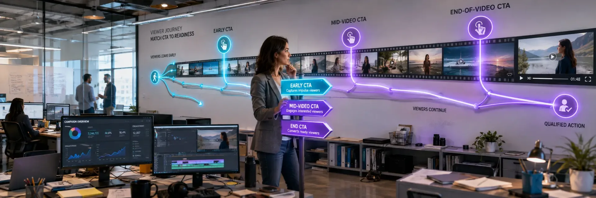
Early CTAs suit low-friction continuation, mid-video CTAs work after meaningful value or evidence, and end-of-video CTAs fit higher-commitment actions supported by the full narrative.
Strong placement keeps one primary ask, makes it understandable on mobile and with captions, and ensures the destination page continues the video’s promise.
Performance should be judged through retention, CTA exposure, clicks, qualified actions, and downstream conversion together, because a higher click rate alone does not prove better placement.
Key Takeaways
- Choose video CTA placement by matching viewer readiness, delivered proof, requested commitment, and destination-page intent – not by following a universal timestamp.
- Use early CTAs for low-friction continuation, mid-video CTAs after meaningful value or evidence, and end-of-video CTAs when the full narrative supports a decisive action.
- Measure retention, CTA exposure, clicks, qualified actions, and downstream conversion together; a higher click rate does not prove better placement.
- Keep one primary ask, make it understandable with captions and on mobile, and ensure the destination page continues the video’s promise and commitment level.
Video CTA placement determines what a viewer is asked to do next, where that action leads, and how much commitment the message has earned.
But the final frame is not automatically the strongest place for every video CTA.
The right moment depends on the readiness the video has built, the proof it has delivered, and the next step the destination page requires.

What video CTA placement actually decides
Many teams treat the end-of-video CTA as the default answer.
That can work for viewers who stay through the full message and reach its strongest evidence.
It can miss viewers who are ready to act earlier, as well as viewers who need a lower-commitment step before they will respond.
The button is only the visible part.
The decision takes shape across the message.
A video CTA is a decision route, not just a button
A video CTA tells the viewer what action is available next.
It may be spoken by the presenter, shown as on-screen text, built into a clickable element, placed in a CTA overlay, or added through an end-frame, end-screen, description, or pinned comment.
These formats can support different moments.
A spoken CTA can clarify the action.
A visual CTA can keep the option visible.
A clickable overlay can shorten the path.
An end-of-video CTA can gather the full message into one final choice.
Treat the CTA like a signpost, not a sticker.
A signpost helps only when it points to a destination that makes sense from the viewer’s current position.
The destination page must continue the same promise, ask, and level of commitment.
If the video invites a viewer to compare options, a page that moves straight to lead capture can create friction even when the click occurs.
That is why video CTA placement cannot be judged by clicks alone.
A click may begin a useful next step, or it may expose a gap between the video promise and the destination page.
Downstream conversion depends on that continuity, and so does the quality of the response.
The quiet failure often happens after the click.
A mid-video CTA can support viewers who already have enough context to continue.
It can also interrupt video retention if it appears before the message has earned attention or trust.
An end-of-video CTA gives the full narrative room to develop, but some viewers may never reach it.
Therefore, placement is both a content decision and a funnel decision.
It affects the moment of the ask, the proof available at that moment, and the path that follows.
The primary ask must match the commitment the video has earned
Viewer readiness is not a single state.
A person may be learning, checking evidence, comparing choices, preparing a reply, or ready to request a demo.
Each state supports a different level of commitment.
A useful order moves from lighter actions to heavier ones:
- Learning: watch another relevant explanation.
- Evidence: review supporting details or a related resource.
- Comparison: examine options or differences.
- Response: reply, comment, or share a question.
- Evaluation: request a demo or download a resource.
- Commitment: submit lead information or make a purchase.
The list is not a fixed ladder.
The video’s purpose and audience still set the threshold.
A product comparison may support a direct evaluation request.
A short educational video may support a related resource click instead.
Ask for the action the message can support.
The practical test is to compare three elements: what the viewer has learned, what the CTA asks for, and what the destination page requires.
If the video creates interest but the CTA asks for a high-commitment action, the gap can reduce response quality.
If the CTA asks for too little after strong evidence, it can waste a ready buying moment.
CTA copy makes that commitment visible.
“Learn more”, “See the comparison”, “Request a demo”, and “Buy now” do not carry the same weight.
The words should name the next step plainly, while the placement should give that step enough support.
A channel can report strong engagement and still produce weak commercial value if the primary ask is out of step with readiness.
Therefore, the decision is not simply early CTA versus end-of-video CTA.
It is which ask belongs at which point in the message.
Video CTA placement works when timing, commitment, and destination page tell one consistent story.
The next decision is more specific: which part of the video should earn the evidence needed for that ask?

Early, mid-video, or end: how to choose the placement zone
Video CTA placement should match viewer readiness, message purpose, and the action you want next.
But an early CTA is not always premature, and an end-of-video CTA is not always the strongest choice.
The common rule that every video should save its CTA for the end misses viewers who leave early and asks too little of the evidence earned along the way.
When an early CTA is appropriate
An early CTA fits a low-commitment next step.
It can point viewers to more information, invite a simple interaction, or make the next option visible before attention drops.
This placement also helps when many viewers may leave before the video ends.
A short CTA overlay can capture intent without asking for a major decision.
The copy should stay light, and the destination page should match that low level of commitment.
But early visibility has a cost.
A strong sales request may interrupt the message before the viewer understands the problem, offer, or value.
That interruption can weaken attention while the video is still earning trust, reducing the quality of the response that follows.
The early CTA works best as an invitation, not a demand.
Use it to open a path, not force a choice.
When a mid-video CTA belongs after value or proof
A mid-video CTA fits the point where the viewer has received a clear benefit, credible proof, or useful answer.
The placement feels earned when the message has already reduced some doubt.
The trigger may be a narrative payoff, a product explanation, a proof moment, or a point where viewers often replay part of the video.
These signals do not prove readiness on their own.
They give the team a better basis for testing whether the request belongs there.
The key question is simple: what changed for the viewer just before the CTA appeared?
If the answer is unclear, the CTA may interrupt the story rather than advance it.
That is the quiet advantage of mid-video placement.
It can connect interest to action while the reason to act remains fresh, giving the destination page a more qualified visit.
When the end-of-video CTA is the strongest fit
An end-of-video CTA is often the strongest fit for a decisive action.
It works well when the video needs to complete a narrative, deliver its proof, or establish enough context for a higher-commitment request.
By this point, the viewer has had time to assess the message.
A direct CTA can then send that interest to a clear destination page, such as a request, purchase, or deeper evaluation step.
The ask should match what the video has actually earned.
Still, the final position has a blind spot: it reaches only viewers who stay.
If retention drops before the close, an end-of-video CTA may miss interested viewers who were ready for a smaller next step earlier.
So the end is strongest when completion matters more than reach.
It is less useful as a default rule for every video.
When repeated light reinforcement is better than repeated primary asks
Repeated placement can help when one decision needs support across several viewer moments.
The mistake is treating every appearance as a new sales request.
A better pattern uses one primary action with light reinforcement.
An early mention can make the option visible.
A mid-video reminder can connect it to value.
The final CTA can make the same decision clear and easy to take.
The copy, destination page, and expected commitment should remain consistent.
Multiple competing CTAs create choice friction and make downstream conversion harder to read.
One action, repeated with restraint, gives the viewer more chances without splitting intent.
The next question is what the viewer should see, read, and do once the CTA appears.

The placement decision matrix: purpose, length, audience, proof, and action
Video CTA placement should be chosen from the viewer’s readiness, the video’s purpose, and the action that follows.
But no fixed timestamp can make that decision for you.
The common belief is that the most visible CTA will produce the most useful response, yet placement only works when the message has earned the next step.
A video can hold attention and still ask for too much.
It can explain a problem clearly and still send viewers to the wrong destination page.
That gap affects click quality, downstream conversion, and the trust carried from the video to the next step.
Use this framework before choosing a placement zone:
| Placement zone | Viewer readiness | Proof or context needed | Interruption risk | Suitable purpose | Typical commitment | Destination-page intent |
|---|---|---|---|---|---|---|
| Early CTA | The viewer can recognize a relevant next step but may not be ready for a high-commitment action | Enough context to make a low-friction continuation useful | Higher if the ask interrupts the opening or precedes value | Introduce a resource, related content, or simple interaction | Low | Continue learning, access related information, or take another light step |
| Mid-video CTA | The viewer has received a meaningful benefit, explanation, or proof moment | Clear value or evidence immediately before the ask | Moderate; the CTA should follow a natural pause rather than break the argument | Connect demonstrated value to the next action | Low to medium, depending on the proof delivered | Continue evaluation, review evidence, or explore the explained option |
| End-of-video CTA | The viewer has reached the narrative or proof point that supports the requested decision | Sufficient evidence and narrative completion for the intended commitment | Lower for viewers who reach the close, but it misses viewers who leave earlier | Make the decisive final request | Medium to high, when earned by the video | Move directly into the corresponding evaluation, lead, demo, or purchase step |
| Repeated-light reinforcement | The same primary decision should remain available across multiple viewer moments | Each reminder must connect to the same value, proof, and destination | Cumulative risk if reminders become competing asks | Reinforce one primary action without introducing new requests | The same commitment as the primary CTA | Preserve one consistent promise and next step across the video |
Use the viewer’s purpose, audience temperature, proof level, narrative completion, and platform constraints to qualify the framework rather than treating any row as a universal rule.
Educational and awareness videos
Educational and awareness videos usually ask viewers to keep learning, name a problem, or take a low-commitment next step.
They often reach people who recognize a need but have not chosen a solution.
That makes an early CTA risky when it asks for a sales action.
A viewer may accept a related guide, subscribe, or watch a connected video.
A request for a demo or purchase may arrive before the message has built enough context.
But “educational” does not mean “wait until the final frame”.
If the video answers a narrow question, a relevant CTA can appear after the first useful insight.
The action should extend the learning rather than interrupt it.
A practical test is simple: could the viewer explain why the next resource helps before clicking?
If the answer is unclear, the CTA copy is ahead of the viewer’s readiness.
The risk is a mismatch between interest and intent.
A viewer may be engaged with the topic yet still be far from a commercial decision.
Therefore, measure the quality of the next action, not just the number of clicks.
For this format, a mid-video CTA can work after the video has named the problem and given the viewer a reason to continue.
An end-of-video CTA can ask for a larger commitment after the full explanation.
In both cases, the destination page should pick up the exact question the video created.
Product, sales, and testimonial videos
Commercial videos have a different burden.
They must connect attention to trust, then connect trust to action.
The right video CTA placement depends less on runtime alone and more on the proof delivered before the request.
A product video with a simple offer may introduce an action early, then repeat it after the main benefit is clear.
A product with several steps, buyer roles, or setup questions may need more explanation before asking for contact information.
Testimonials need similar care.
A viewer may trust the speaker before understanding the product.
A CTA that appears too soon can shift attention from the customer’s experience to the seller’s request.
The message loses force at the exact moment trust is forming.
What should change first: the placement or the request?
Often, it is the request.
A lower-commitment CTA can appear earlier, while a higher-commitment action waits for product clarity and relevant evidence.
Think of proof as a threshold, not a decoration.
The viewer does not need every claim answered, but the video should support the specific action being requested.
Therefore, “learn more”, “compare options”, and “book a conversation” should not share the same placement by default.
Review three signals together:
- Audience temperature: Is the viewer new to the problem, familiar with the category, or already evaluating options?
- Action commitment: Does the CTA ask for a click, a subscription, a form submission, or a purchase conversation?
- Narrative completion: Has the video answered enough for the requested action to feel reasonable?
This prevents a common mistake: treating a testimonial like an ad or treating a sales video like an introduction.
Commercial intent may support an early CTA, but only when the message and destination page make the next step clear.
Webinars, long-form video, and short-form social video
Length changes the number of useful CTA moments, but it does not decide their purpose.
Long-form video can support several actions across the viewing experience.
Short-form video has less room for interruption and less time to recover from a weak opening.
A webinar may introduce a low-commitment action near the start, place a related offer after a teaching point, and close with the main conversion request.
Each placement should match what the viewer has just learned.
That sequence works best when every CTA has a distinct job.
Repeating the same request can make the presentation feel like a sales break.
Changing the action without a clear link can scatter attention and weaken conversion quality.
Short-form video calls for tighter judgment.
An early CTA may protect the value of a fast-moving clip when the desired action is simple.
A mid-video CTA can interrupt the payoff if it arrives before the central point lands.
An end-of-video CTA may reach fewer viewers, but those viewers have shown stronger retention.
The weak signal often looks like a win: many viewers see the CTA, yet few take a useful next step.
Therefore, compare CTA exposure with retention and downstream conversion rather than judging placement from visibility alone.
Review where attention is strongest and what the video has earned at that point.
In long-form content, the answer may be several moments.
In short-form content, the best CTA may be brief copy that appears after the value is clear, not a longer spoken request that breaks the pace.
Paid YouTube ads versus organic YouTube videos
Distribution context changes the job of the video CTA.
A paid YouTube ad usually seeks a commercial action.
An organic YouTube video may seek a subscription, another view, a share, a playlist action, or a visit to a related resource.
But the same placement rule cannot serve both goals.
Paid ads must connect the viewer’s current problem to a clear next step within limited attention.
Organic videos can support continued viewing and channel engagement, so an end-of-video CTA may point to the next piece of content instead of a sales page.
This distinction also changes how interruption risk should be judged.
In a paid ad, an early CTA may clarify the offer before the viewer leaves.
In an organic video, the same interruption may weaken video retention if it appears before the main promise is fulfilled.
CTA overlays and end screens can help, but their presence does not remove the need for message fit.
An overlay that asks for a commercial action during an educational explanation may compete with the idea on screen.
An end screen that offers a related video can extend attention with less friction.
Ask one question before choosing the placement: is the next action part of the video’s promise, or is it a separate request?
If it is part of the promise, place it near the moment that promise becomes clear.
If it is separate, delay it or reduce the commitment.
That rule closes the earlier open loop.
The best placement is not the point that reaches the most viewers; it is the point where purpose, readiness, delivered evidence, and action ask the same thing.
The next decision is the destination page: can it continue that same level of readiness after the click?

Use retention and engagement data to move the ask
Video CTA placement should respond to what viewers do, not just where the script ends.
But a retention graph cannot choose CTA timing on its own.
Treating one signal as the answer can push the ask away from viewer readiness, weakening conversion quality and wasting attention.
Read retention curves and drop-off points as placement signals
A retention curve shows where attention holds, weakens, or breaks.
Those changes can inform whether an early CTA, mid-video CTA, or end-of-video CTA has a fair chance to work.
A sharp drop before the current CTA may show that the ask arrives too late for many viewers.
Moving the full request earlier may capture people who received enough value to act.
A lighter CTA overlay can reinforce the message without interrupting the main flow.
But a drop-off point is not automatic proof that the preceding moment caused the loss.
The topic may have changed.
The opening promise may have been fulfilled.
The platform may have moved viewers into another recommendation.
Treat the curve as a placement signal, not a verdict.
The curve is a map of attention, not a map of intent.
Read the data in sequence:
- Where does meaningful information begin?
- Where does the viewer receive the main proof?
- Where does the narrative reach a natural pause?
- Where do viewers leave before the ask appears?
If most viewers leave before the final request, test a lower-commitment prompt near the point where the main idea becomes clear.
If viewers stay through the proof and leave after the CTA, the placement may be sound while the CTA copy or destination page creates friction.
Therefore, do not move a CTA simply to chase higher view duration.
Move it when the data suggests a better match between attention and readiness.
Use replay clusters, proof moments, and high-intent behavior carefully
Clicks are useful, but they are only one form of engagement.
Replays, pauses, comment activity, form starts, and visits to a destination page may show that a viewer is evaluating a claim or trying to understand a detail.
A replay cluster around a product explanation may support a CTA near that explanation.
A replay around a customer quote may suggest that the proof deserves a related next step.
A pause near pricing or process details may signal careful review, but it does not confirm purchase intent.
That distinction protects the strategy from a common error: treating every strong signal as permission to ask for a sale.
Use engagement data to form a hypothesis.
Then test whether the behavior leads to a useful action.
A viewer who replays a claim but never visits the destination page may need clearer context.
A viewer who reaches the page but does not complete the next step may face a mismatch between CTA copy and page promise.
The best placement often follows the moment of reduced uncertainty, not the moment of maximum activity.
This changes how teams read a video.
The question is not simply, “Where did people interact?”
It is, “What did they appear to understand, inspect, or need next?”
The answer should shape the CTA format and commitment level.
A soft prompt may fit an evaluation moment.
A direct request may fit a completed argument.
An end-of-video CTA may work when the message needs the full narrative to make sense.
Therefore, engagement signals should guide the ask, while the destination page confirms whether the ask was well chosen.
What to do when analytics data is sparse or unreliable
Some videos do not produce enough clean data for confident placement decisions.
A small audience, incomplete tracking, muted playback, platform limits, or inconsistent traffic sources can make the retention curve hard to read.
That does not leave the team without a method.
Start with five questions:
- What job does the video perform?
- How ready is the audience before viewing?
- What proof has the video delivered at each possible CTA point?
- Does the narrative feel complete at that moment?
- How much commitment does the next action require?
An awareness video may need a low-friction action, such as another useful resource.
A product explanation may support a visit to a relevant destination page once the core problem and response are clear.
A sales video may need a direct next step, but only after the viewer has enough reason to accept it.
Platform limits matter as well.
An overlay, caption, description link, or spoken CTA may compete with the same visual moment.
If the format makes the request easy to miss, changing the words alone will not solve the problem.
Think of sparse data as a dim room: first use the shape of the furniture before guessing at every detail.
The video purpose, audience temperature, delivered proof, and action cost provide that shape.
Then choose a starting placement with a clear reason.
Record the assumption.
State what behavior would support a move earlier, later, or into a lighter reinforcement position.
This keeps a weak dataset from turning into false certainty.
Test placement without treating timing claims as universal rules
Testing video CTA placement works best when the test compares meaningful choices, not arbitrary timestamps.
Compare placement zones, such as early, mid-video, and end-of-video, alongside the CTA format and copy.
Keep the decision tied to viewer readiness.
A direct CTA may create more clicks yet fewer qualified actions.
A lighter prompt may produce fewer immediate visits while sending better-matched viewers to the destination page.
Retention can show whether the ask disrupts viewing, but downstream conversion shows whether the action had business value.
That is the measurement gap many teams miss.
A useful test asks four linked questions:
- Did viewers reach the CTA?
- Did they understand the request?
- Did they click or start the intended action?
- Did the next page or sales step support completion?
Do not treat a small or unreliable dataset as a universal rule.
A result may reflect audience mix, traffic source, creative quality, platform behavior, or the destination page.
Repeat the comparison when the decision matters, and keep the claim narrow: this placement supported this audience and this action under these conditions.
The myth to discard is simple: there is no best CTA timing apart from the message and the viewer.
There is only a better-supported placement decision.
Retention and engagement data help locate the moment when attention can support an ask; viewer readiness and downstream conversion decide whether that ask deserves to stay there.
The next question is how CTA copy and destination-page fit turn that moment into a completed action.

One primary ask, presented in the right format
Video CTA placement does more than mark the end of a video; it defines the next decision a viewer can make.
But a clear request can lose force when it competes with a subscribe prompt, appears in the wrong format, or asks for more commitment than the viewer has earned.
The common belief is that a visible CTA is doing its job, yet visibility alone does not make the next step clear or actionable.
Separate the video’s primary conversion ask from channel actions
A video can invite a demo, download, reply, lead capture, or purchase.
It can also ask viewers to subscribe, share, or comment.
Those actions may support attention, but they do not have the same commercial value.
Treat the commercial action as the primary ask.
Keep channel actions secondary unless audience growth is the video’s direct purpose.
A viewer who hears three requests may remember none of them clearly.
The distinction is simple: one action moves the buyer forward, while another increases activity around the channel.
Both can appear, but they should not compete for the same moment, visual space, or sentence.
That is where CTA discipline starts.
A spoken line might name the commercial next step.
An end screen or pinned comment can carry the channel action without pulling focus from it.
Therefore, the viewer gets a clear path instead of a pile of requests.
The myth is that more CTA options create more chances to convert.
In practice, extra options can make the intended action harder to spot.
The strongest video CTA often gives the viewer one decision, then removes everything that distracts from it.
Choose spoken, visual, clickable, or combined presentation
The right video CTA format depends on the channel, the viewer’s attention, and the action’s required effort.
A spoken CTA can explain why the next step matters.
On-screen text can make the request easier to recall.
A clickable element can shorten the path when the platform supports it.
No single format wins in every setting.
A lower third may fit a mid-video CTA that must remain visible without taking over the frame.
An overlay may help with clarity, but it can interrupt the point being made.
An end frame can give a high-intent viewer time to act, while a description or pinned comment can carry the destination when a direct click is unavailable.
The choice should follow the job.
If the viewer needs context, use speech.
If the viewer needs a clear label, add visual text.
If the viewer is ready to act, provide a clickable route where the channel allows it.
A combined presentation can work when each element adds a different layer rather than repeating the same words.
A useful review question is: what would disappear if one format were removed?
If the answer is “nothing”, the CTA may be carrying decoration instead of decision support.
Presentation also affects access.
Important CTA copy should not exist only in audio, and a visual request should remain understandable without a fast verbal explanation.
Therefore, the format supports comprehension across viewing conditions while keeping the message compact.
The channel sets the limits.
The viewer sets the burden you can place on the moment.
Write a specific next step that fits the viewer’s readiness
CTA copy should tell the viewer what to do and what kind of value comes next.
“Learn more” leaves the destination unclear.
“Compare the plans” signals evaluation.
“Download the checklist” names a lower-commitment action.
“Book a demo” asks for a stronger decision.
The wording should match the viewer’s readiness and the video’s proof level.
A short educational video may earn a request to learn, compare, or reply.
A product demonstration may support a request to evaluate or book.
A purchase ask requires a destination that can carry that level of intent.
This is where generic action language breaks down.
The words may sound active, yet they give the viewer no clear reason to continue.
Specific CTA copy reduces guesswork at the exact point where attention is most limited.
Ask one hard question: what decision has the video actually earned?
If the content explains a problem but does not establish a fit, a direct sales ask may feel premature.
If the video has answered the main concern and the destination page continues that proof, a stronger request may make sense.
The CTA should finish the thought, not change the subject.
A practical edit is to connect the verb to the destination.
“See how the process works” should lead to a page that explains the process.
“Compare options” should lead to a comparison experience.
“Reply with your question” should create a clear response path.
Therefore, downstream conversion depends on continuity between the promise in the video, the CTA copy, and the destination page.
A click can register as success while the next page quietly breaks the expectation.
Set visibility and dwell time without interrupting attention
Visibility is a timing decision, not a demand for constant exposure.
A CTA overlay that appears during a key explanation can split attention.
A lower third that stays too long can become background clutter.
An end frame that disappears too fast can deny a ready viewer enough time to respond.
The right dwell time depends on the action and the channel.
A short, low-effort action may need brief reinforcement.
A form, download, or booking step may need a calmer end-of-video CTA with enough space to read the copy and understand the destination.
The aim is to pause the decision, not the experience.
Keep the message legible, place it where the viewer can find it, and avoid covering the content that makes the request credible.
Retention data can help locate interruption risk, but it cannot set a universal display rule.
Review when the CTA appears, what the viewer has just learned, and whether the destination continues the same promise.
A visible CTA with weak continuity may create attention without useful action.
The hidden test is simple: can a viewer repeat the next step after the CTA disappears?
If not, revise the wording, format, or dwell time before adding more screen presence.
Therefore, video CTA placement should make the intended action easy to understand first and easy to access second.
One primary ask works when every part points to the same decision: the wording names it, the format carries it, and the destination page keeps the promise.
The next question is whether that page is ready for the viewer the video just moved forward.

Mobile, captions, and platform constraints change the placement decision
Video CTA placement must work across sound settings, screen sizes, player controls, and device behavior.
But a CTA that performs well in a desktop review may fail on a phone or during silent playback.
The common belief is that strong timing is enough; in practice, the request must remain understandable and usable across the conditions that shape the viewer’s next action.
Make the CTA understandable with sound on or off
Sound-off viewing exposes a common myth: captions can carry the whole CTA.
They cannot if the spoken request, caption text, and visible CTA say different things or appear at different moments.
The viewer should be able to identify three things without guessing: what to do, why to do it, and where the action leads.
Spoken language can provide the reason.
Captions can preserve the meaning.
Visible CTA copy can keep the action available when attention shifts from the video to the player.
But these layers should not compete.
A voiceover that says “book a consultation”, captions that shorten it to “learn more”, and a button that leads to a general destination page create three different next steps.
That weakens downstream conversion even if the video retention curve looks healthy.
A better review asks whether the request survives each mode on its own.
If the viewer hears the video, the action should be clear.
If the viewer reads captions, the action should remain clear.
If the viewer notices only the visible treatment, the destination should still make sense.
The practical rule is easy to repeat: a CTA should lose volume before it loses meaning.
That distinction matters for accessibility, but it also matters for acquisition.
A viewer who understands the offer yet cannot identify the next step has received persuasion without a usable path.
Protect mobile readability and player usability
Mobile changes the cost of visual clutter.
A CTA overlay may cover product detail, block a face, compete with native player controls, or shrink the usable viewing area until the request feels intrusive.
Readable CTA copy needs space, contrast, and enough time on screen.
The click target must be easy to notice without demanding precise control from a viewer holding a phone.
Small text and crowded overlays create friction before the destination page ever loads.
But more screen presence is not the same as more action.
A large overlay can interrupt video retention, pull attention from the proof, or make the player feel difficult to use.
Therefore, placement should be judged against the moment’s job: introduce the action, reinforce it, or capture a ready viewer.
One useful review separates attention from usability.
First ask, “Will the viewer notice this?” Then ask, “Can the viewer understand and use it without losing the video?” A CTA that passes the first test and fails the second is visible waste.
The quiet failure is often the easiest to miss: the CTA appears on the right frame, yet the viewer cannot comfortably read or activate it.
That is a placement problem, even if the script timing is sound.
For mobile, the decision is less about decorating the player and more about protecting the next action.
Keep the request distinct from controls, keep the copy short enough to scan, and check the full viewing path from video to destination page.
Account for platform and player limitations
A video CTA does not have one fixed delivery method.
An overlay, card, end screen, clickable element, or lead gate may depend on the platform, player, device, account setup, or viewing context.
That creates a planning risk.
Teams may approve CTA timing in the script, then discover that the preferred format is unavailable, behaves differently, or reaches only part of the intended audience.
The placement decision must therefore include a fallback path before production or distribution begins.
The fallback should preserve the action, not just the words.
If a clickable element cannot appear, the spoken request and visible URL should still point to a clear destination page.
If a lead gate adds friction, the team should weigh the value of the captured information against the loss of immediate viewing and trust.
If an end screen has limited room, one primary ask should retain visual priority.
But a fallback is not permission to repeat every CTA in every format.
Multiple prompts can make the experience feel crowded and blur the intended next step.
The right question is not, “Where can we place another button?” It is, “Which available format best carries this request for this viewer?”
Platform limits can reveal a strategic weakness early.
If the CTA works only as a specific overlay or player feature, the message may be too dependent on software rather than clear communication.
The decision lens is now sharper: video CTA placement is complete only when the request remains understandable, usable, and reachable across the viewing conditions that matter.
That protects the path from attention to action; the next question is whether the destination page keeps the promise intact.

The CTA has to continue on the destination page
Video CTA placement is complete only when the destination page continues the action the viewer was asked to take.
But a click can look like progress while the page resets the conversation, weakens trust, and reduces the chance of a qualified next step.
The common belief is that the CTA ends at the click; in practice, the click begins a new evaluation of the promise, the page, and the commitment.
Match the destination page to the action requested
The destination page should match the commitment made in the video CTA.
A request to learn should lead to useful information.
A request to review evidence should lead to proof.
A comparison CTA should open a page that helps the visitor compare options.
The same rule applies to reply, demo, download, lead capture, and purchase CTAs.
A reply request needs a clear response path.
A demo request needs a page that explains what happens next.
A download CTA should make the promised resource easy to find.
A purchase CTA should move directly into the buying task.
Treat the video and destination page as one decision unit.
Ask what the viewer expects to receive, what the page asks them to do, and whether the gap between those actions is small enough to sustain momentum.
A page can be relevant to the company yet wrong for the CTA.
Relevance describes the topic; continuity preserves the decision.
That distinction affects trust, conversion quality, and the amount of effort required from the visitor.
Check the promise, wording, and next step for continuity
Post-click continuity has three parts: the promise in the video, the wording of the video CTA, and the first action on the destination page.
Each part should point in the same direction.
If the video says “see how it works”, the page should make that explanation easy to locate.
If the CTA says “compare plans”, the page should support comparison before asking for contact details.
If the video offers evidence, the page should lead with evidence rather than burying it below a general brand message.
CTA copy sets an expectation in a few words.
The page then either confirms that expectation or breaks it.
A mismatch can appear in the headline, page layout, form length, offer, or requested commitment.
The review can stay simple.
Read the final spoken line, the on-screen CTA, the destination-page headline, and the first form or button.
Then ask whether a viewer would describe them as the same next step.
This is where CTA timing connects to conversion quality.
An early CTA may attract a viewer who wants more information.
An end-of-video CTA may reach someone ready for a deeper commitment.
But neither placement can compensate for a destination page that asks for a different decision.
The weak point may sit after the video.
Do not confuse a CTA click with a qualified outcome
Views and video retention show attention.
Watch-through rate shows how far viewers stayed.
Clicks show that some viewers chose to continue.
None of these signals, on its own, proves that the next step had value for the business.
A qualified lead, completed action, downstream conversion, pipeline movement, or revenue event answers a different question: did the viewer’s action produce a useful business result?
The right measure depends on the CTA and the destination page.
A download CTA may be judged first by completed downloads and lead quality.
A demo CTA may require review of completed requests and later sales acceptance.
A purchase CTA should connect to the completed buying action rather than treating the click as the outcome.
Therefore, read performance in sequence.
Check video retention, CTA exposure, clicks, page engagement, completed actions, and the later business outcome when that data is available.
A strong result at one step does not erase friction at the next.
Measure the furthest meaningful action the CTA was meant to create.
That keeps placement decisions tied to customer acquisition, conversion quality, and downstream business value rather than to a shallow signal.
The best video CTA placement is not the moment that produces the most clicks.
It is the moment that creates the right expectation for the next page, where viewer readiness can become a qualified action.
The next question is how to test that full path without rewarding a shallow signal.

When CTA optimization is the wrong starting point
Video CTA placement should be the last diagnostic for a video that has not yet earned a next step.
But moving an early CTA, mid-video CTA, or end-of-video CTA cannot repair weak value, proof, or relevance.
Many teams assume every conversion problem starts with the CTA, yet the harder question is whether the video has prepared the viewer to act.
The video has not delivered enough value or proof
A CTA asks the viewer to move.
The video must give that movement a reason.
Value can take different forms.
The video may clarify a problem, show how a process works, present relevant evidence, or help the viewer judge a possible solution.
Proof can come from the substance of the explanation, the fit of the offer, or evidence that reduces doubt.
Without one of these supports, a CTA becomes an interruption rather than a next step.
A better CTA position cannot create missing substance.
An overlay may be easy to see, but visibility does not make the request more credible.
An end-of-video CTA may arrive at the right time, yet still ask for a decision the video has not prepared the viewer to make.
The practical test is to remove the CTA and inspect the final message.
Could a reasonable viewer state what problem the offer addresses, why it may fit, and what they will gain from continuing?
If the answer is unclear, changing placement treats the surface rather than the cause.
The weak point may sit earlier than the CTA.
Review the video for three gaps:
- Value gap: The viewer learns too little to justify another step.
- Proof gap: The claim is present, but support or evidence is thin.
- Reason-to-continue gap: The next action is named, but its benefit is unclear.
These gaps affect downstream conversion in different ways.
A value gap may produce passive viewing.
A proof gap may create interest without trust.
A reason-to-continue gap may produce clicks that stop once the viewer reaches the destination page.
Therefore, the first repair may belong in the message, not the CTA layer.
The ask is more committed than the viewer’s readiness
Viewer readiness is the distance between understanding the offer and accepting the next commitment.
A cold viewer may be ready to learn more.
A qualified viewer may be ready to compare options.
A buyer who has seen clear evidence may be ready to request a demo.
Those states are different.
The same video CTA cannot serve all three without creating friction.
Asking for a demo before the video establishes relevance can feel premature.
Asking a cold viewer to buy can skip the evaluation step.
A lead gate can create resistance when the viewer has received little useful context in return.
CTA copy reveals the mismatch quickly.
“See how it works” asks for less commitment than “Book a demo”.
“Get the guide” differs from “Talk to sales”.
The words matter, but the promise behind them matters more.
A low-commitment phrase cannot make a high-friction destination feel natural.
What should change first: the CTA timing or the ask itself?
Often, the ask deserves review before the frame does.
Use the viewer’s likely next question as the decision rule.
If the viewer still needs explanation, offer a deeper resource.
If the viewer needs confidence, offer relevant proof.
If the viewer is ready to discuss fit, a sales conversation may make sense.
Therefore, CTA timing should follow the decision the video has prepared, not the action the business prefers.
This also explains why video retention can mislead.
A viewer may stay through the full video and still lack enough confidence to take a high-commitment action.
Retention shows attention.
It does not, by itself, show readiness.
The repeatable insight: a viewer can finish the video without finishing the decision.
The destination page cannot continue the video’s logic
A video CTA and its destination page form one decision path.
The page should continue the same question, promise, and level of commitment that the video established.
If it changes any of those without a clear reason, CTA optimization may simply move confusion from the player to the page.
Look for three breaks after the click.
The page may use a different message.
It may ask for a larger commitment.
Or it may leave the viewer unsure what to do next.
A video that invites someone to learn more should not send them to a page that opens with a hard sales request unless the video prepared them for that shift.
The issue is often visible in the first screen of the destination page.
Does the headline confirm the video’s promise?
Does the page explain the next step in plain language?
Does the form, offer, or purchase path match the viewer’s readiness?
If the answer is no, a new CTA position will not solve the downstream conversion problem.
Think of the click as a transfer of attention.
The page receives that attention with a limited amount of trust.
If the page resets the conversation, the viewer must rebuild the case for action from the start.
That is where placement work reaches its boundary.
First confirm that the video delivers value and proof, then match the ask to viewer readiness, then check that the destination page carries the same logic forward.
Only after those conditions hold can CTA timing reveal a meaningful difference rather than mask a deeper problem. The right video CTA placement is not the first fix for weak persuasion; it is the final expression of a decision the video has earned.
The next question is how to test that earned decision without mistaking more clicks for better conversion.

How to judge whether the placement decision is working
Video CTA placement is working when the right viewers take the right next action.
But a high click rate can hide weak viewer readiness, poor retention, or low-quality follow-through.
The common belief is that the best position wins by generating the most clicks, yet the stronger test connects timing, action quality, and downstream conversion.
Placement quality indicators
Start with the decision the video is meant to support.
A video that builds awareness may need a light next step.
A video that explains a solution may support a deeper action.
A sales-focused video may ask for direct contact or another clear commitment.
One video should have one primary ask.
Secondary prompts can compete with it, especially when a viewer must choose between subscribing, sharing, downloading, booking, or visiting a page.
Therefore, judge the CTA by the clarity of the intended action, not by the number of options presented.
The ask should match viewer readiness.
An early CTA can work when the viewer already understands the problem and sees a useful reason to continue.
A mid-video CTA can fit after a meaningful insight or demonstration.
An end-of-video CTA can make sense after the message reaches its natural decision point.
But placement alone does not show readiness.
Look at what the viewer has seen before the ask: a clear problem, useful explanation, relevant evidence, or a completed narrative.
If the CTA arrives before that point, it may ask for commitment before the video has earned it, which can reduce conversion quality even when exposure is high.
The quiet test is usability.
Can a viewer read the CTA overlay on a small screen?
Does the message remain clear with captions on and sound off?
Is the button or link easy to recognize around player controls?
Does the CTA copy tell the viewer what happens next?
A useful review asks three questions: Is there one main action?
Does the ask follow enough value?
Can the viewer act without extra guesswork?
Weakness in any one of these areas can make a well-timed CTA feel premature and send attention to the wrong next step.
Behavior and conversion indicators
How To Interpret CTA Performance Signals Table
| Observed signal | What it may indicate | What it does not prove | Recommended focus |
|---|---|---|---|
| A sharp drop near a mid-video CTA | The ask may be poorly timed, weakly relevant, or disruptive to the narrative | The CTA alone caused the drop | Review timing, relevance, and interruption risk |
| Stable retention with few clicks | CTA copy, offer fit, or audience readiness may be weak | The placement is necessarily wrong | Review the wording, commitment level, and offer fit |
| Strong clicks with weak downstream conversion | The destination page or post-click experience may not continue the video’s promise | The CTA placement created useful business value | Check page continuity, friction, and completed actions |
| Replay clusters around a product explanation or customer quote | Viewers may be evaluating a claim or seeking more context | Viewers are ready to purchase or request a demo | Test a relevant, appropriately committed next step |
| Viewers leave before the final CTA | A later ask may miss viewers who were ready for a lighter action earlier | Moving the full high-commitment request earlier will solve the issue | Test earlier light reinforcement or a lower-commitment prompt |
Read performance in sequence.
First, examine video retention and watch-through rate around the CTA.
Then review drop-off, replay, and engagement signals.
After that, examine CTA clicks, qualified actions, and downstream conversion.
This sequence separates exposure from intent.
A viewer may see an early CTA without acting.
Another may watch through an end-of-video CTA and click later from the destination page.
A third may click quickly but leave without completing the intended action.
The dashboard will not explain the gap by itself.
Compare behavior before and after the ask.
A sharp drop near a mid-video CTA may signal poor timing, weak relevance, or an interruption in the narrative.
Stable retention with few clicks may point to CTA copy, offer fit, or a low-readiness audience.
Strong clicks with weak downstream conversion may point beyond the video, such as a mismatch on the destination page.
Do not treat clicks as the finish line.
Track whether the action is qualified and whether it advances the business goal attached to the video.
For one video, that may mean a completed form.
For another, it may mean a meaningful product interaction or a sales conversation.
The right measure depends on the requested commitment.
Replays and engagement can add context, but they do not replace outcome data.
A replay may show that a point deserves another look.
It does not prove that the CTA earned a business action.
Therefore, use engagement to explain behavior and conversion data to judge value.
The useful question is not, “Which CTA position gets more clicks?”
It is, “Which position produces better actions from viewers who are ready to take them?”
That lens protects the team from moving a CTA simply to improve a surface metric while weakening qualified outcomes.
A final review before changing the CTA position
Before changing an early CTA, mid-video CTA, or end-of-video CTA, review the full decision chain.
The placement may be correct while another part of the experience is weak.
Check these points:
- Video purpose: Is the video building awareness, explaining a solution, supporting evaluation, or asking for action?
- Audience temperature: Does the audience already know the problem, or does the video need to create that understanding first?
- Evidence level: Has the video given the viewer enough information to accept the next ask?
- Desired commitment: Is the CTA asking for a small step or a high-effort decision?
- Observed behavior: Where do viewers pause, leave, replay, engage, or continue?
- Format: Does the CTA work in spoken copy, on-screen text, a CTA overlay, or a combination?
- Accessibility: Can viewers understand and use it with captions, muted sound, and different screen sizes?
- Destination page: Does the page continue the same promise and action without forcing a new decision?
- Measurement quality: Can the team connect exposure to click, qualified action, and downstream conversion?
If several answers are unclear, changing CTA timing may be premature.
Fix the missing signal first.
A placement decision made without a clear purpose, usable format, or measurable destination can create noise instead of learning.
The practical reveal is simple: the winning video CTA placement connects viewer readiness to qualified downstream action, rather than merely winning the click count.
Once that chain is clear, the next optimization target is easier to judge: the message, offer, or page that determines whether the action continues.

Scientific context and sources
The sources below provide research-backed and authoritative context for how attention, interruption, audience familiarity, visual dynamics, message congruence, platform constraints, and accessibility influence video CTA placement and presentation. The evidence aligns with the article’s focus on matching CTA timing to viewer readiness, delivered proof, requested commitment, and destination intent.
- Attention and avoidance in video advertising
“Moment-to-Moment Optimal Branding in TV Commercials: Preventing Avoidance by Pulsing” – Thales S. Teixeira, Michel Wedel & Rik Pieters – Marketing Science, 29(5), 783-804 (2010)
Using eye-tracking and avoidance data, the study shows that attention dispersion and the timing and positioning of branding influence commercial avoidance, supporting CTA visibility as a timing-and-interruption decision rather than a universal final-frame rule.
https://pubsonline.informs.org/doi/10.1287/mksc.1100.0567 - Viewer attention, audience familiarity, and recall
“Moderating Effects of Prior Brand Usage on Visual Attention to Video Advertising and Recall: An Eye-Tracking Investigation” – Lucy Simmonds, Steven Bellman, Rachel Kennedy, Magda Nenycz-Thiel & Svetlana Bogomolova – Journal of Business Research, 111, 241-248 (2020)
Eye-tracking across 64 video advertisements shows that prior brand usage changes how visual attention relates to recall, supporting the principle that the same level of attention may have different effects for audiences with different levels of brand familiarity.
https://www.sciencedirect.com/science/article/pii/S0148296319301523 - Dynamic attention and visual CTA design
“Influence of Dynamic Content on Visual Attention During Video Advertisements” – Brooke Wooley, Steven Bellman, Nicole Hartnett, Amy Rask & Duane Varan – European Journal of Marketing, 56(13), 137-166 (2022)
This eye-tracking study shows that attention to moving elements depends on combinations of salience, relevance, position, and stability, supporting testing CTA placement, visibility, motion, and dwell time rather than assuming that the most central or visually prominent element will always receive useful attention.
https://www.emerald.com/insight/content/doi/10.1108/EJM-10-2020-0764/full/html - Message congruence and continuity
“Online Advertising and Congruency Effects: It Depends on How You Look at It” – Wim Janssens, Patrick De Pelsmacker & Maggie Geuens – International Journal of Advertising, 31(3), 579-604 (2012)
Across three studies, thematic congruence between advertising and surrounding web content affected evaluations and click intentions differently depending on attention conditions, supporting the broader importance of message continuity while not directly testing video-to-destination-page continuity.
https://www.tandfonline.com/doi/abs/10.2501/IJA-31-3-579-604 - Platform functionality and end-of-video CTA constraints
“Add End Screens to Videos” – YouTube Help – YouTube
YouTube documents that end screens are limited to the final 5-20 seconds, require eligible videos and viewing environments, support configurable elements and timing, and may be hidden by viewers, reinforcing the need to account for actual platform constraints when planning end-of-video CTAs.
https://support.google.com/youtube/answer/6388789?hl=en - Captions and sound-off CTA comprehension
“Understanding Success Criterion 1.2.2: Captions (Prerecorded)” – W3C Web Accessibility Initiative
WCAG 2.2 requires synchronized captions for prerecorded audio content in synchronized media, supporting preservation of spoken CTA information in accessible text even though the standard itself does not test the marketing effectiveness of sound-off CTA viewing.
https://www.w3.org/WAI/WCAG22/Understanding/captions-prerecorded/
Questions You Might Ponder
Where should you place a CTA in a video?
Place a video CTA where the viewer has enough context, proof, and motivation for the requested action. Use an early CTA for low-commitment steps, a mid-video CTA after a meaningful benefit or proof moment, and an end-of-video CTA when the full narrative supports evaluation, lead capture, booking, or purchase.
Is an end-of-video CTA always the best choice?
No. An end-of-video CTA works best when viewers need the complete explanation before acting, but it only reaches people who stay until the close. A lighter early or mid-video CTA can capture interested viewers sooner, provided the request matches their readiness and leads to a relevant destination page.
What is the difference between an early, mid-video, and end-of-video CTA?
An early CTA introduces a low-friction next step before attention declines. A mid-video CTA connects action to a recent benefit, explanation, or proof moment. An end-of-video CTA supports a stronger decision after narrative completion. The correct placement depends on audience temperature, proof delivered, interruption risk, and destination-page intent.
How do you measure video CTA placement effectively?
Measure video CTA placement as a sequence: retention and watch-through, CTA exposure, clicks, page engagement, completed actions, qualified leads, and downstream conversion. Click-through rate alone can reward premature or poorly matched asks. The strongest placement produces useful actions from viewers whose readiness matches the requested commitment.
Should a video have more than one CTA?
A video should usually have one primary conversion ask. Light reinforcement can appear early, mid-video, and at the end when each appearance supports the same promise and destination. Multiple competing requests – such as subscribe, download, book, and buy – can split attention, create choice friction, and make performance harder to interpret.